The Story
Why it exists.
The beginning
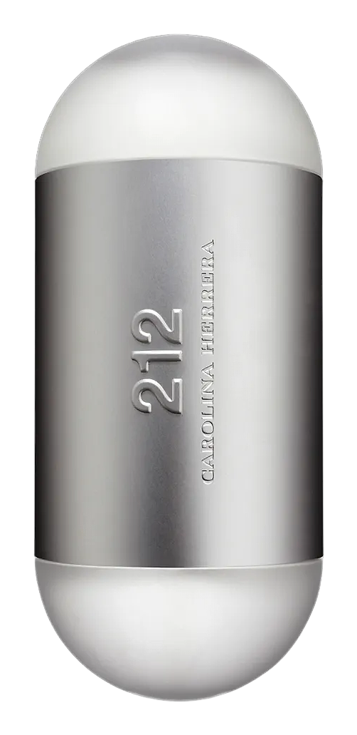
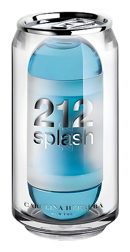
The 212 line has been Carolina Herrera's urban signature since 1997. By 2007, the house decided the collection needed air. Something lighter. Less architecture, more afternoon. The result was 212 Splash, a summer limited edition that took the original's sleek identity and stripped it down to something you could actually cool off in. The packaging told the story before you even opened it: a soda can. Because sometimes a fragrance doesn't need a story. It just needs to be refreshing.
What makes 212 Splash interesting is the citrus accord. Bergamot, grapefruit, and mandarin don't take turns here, they arrive together, a single bright note that hits cold and clean. There's no slow build, no anticipation. The peony and litchi in the heart are where the personality lives: fruity, soft, slightly sweet without being cloying. The rose is barely there, more presence than bloom. The base is where most summer fragrances fail, but cedar and sandalwood keep this grounded. Clean woods, not heavy ones. Musk that stays close to skin. It's a composition built for heat, and it knows it.
The evolution
The first thirty minutes are all citrus, sharp, cold, immediate. It feels like the moment you step outside on a hot day and the air conditioning hits. Then the peony arrives, smoothing everything out, and the litchi adds just a hint of tropical sweetness. The rose is a whisper, not a statement. By hour two, the base notes take over. Cedar and sandalwood settle into the skin, and the musk wraps everything in something close and quiet. The sillage drops early. You'll smell it, but the room won't. On fabric, the citrus lingers longer, a ghost of grapefruit on a cotton shirt, hours later. On skin, four to six hours is the range, depending on your chemistry. The next morning, there's a faint cedar-musk trace. The kind of thing that makes you reach for the bottle again.
Cultural impact
212 Splash existed at an interesting moment in the 212 lineage. By 2007, the collection had established itself as Carolina Herrera's urban signature, sleek, magnetic, designed for a specific kind of New York confidence. The Splash edition was a deliberate departure from that energy. Less architecture, more air. The soda-can packaging was the brand essentially winking at itself. It's been discontinued, which adds a certain appeal for collectors, but it was never rare to begin with, it was designed to be accessible, a summer refresher rather than a statement piece.