
The Story
Why it exists.
The beginning
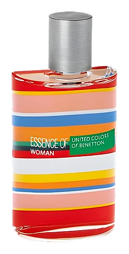
In 2008, Benetton released two new fragrances under its United Colors umbrella. One for him, one for her, both carrying the colorful stripe motif that had become shorthand for the brand's chromatic optimism. Alexandra Kosinski, working with Givaudan's perfumers, created a fruity-floral that captured the concept. Peach, orange, and bergamot opened bright, then handed off to a freesia-jasmine-rose heart. The base grounded everything with patchouli and white musk. The bottle, decorated in cheerful stripes from orange to pink, did not hide its intentions.
The key to this fragrance is its freesia. Not the delicate whisper of freesia in lesser compositions, but something bolder that announces itself before settling down. Jasmine and rose support underneath without competing, creating a heart that feels classically feminine. The patchouli in the base is barely there, more earthy whisper than statement, which keeps the drydown warm without going heavy. The composition as a whole maintains a certain restraint, letting each note find its place without forcing itself forward.
The evolution
The opening announces itself immediately: peach and citrus in a burst of brightness. Then the florals take over. Freesia leads, jasmine follows, and rose lingers underneath in a classic heart that reads as distinctly feminine without tipping into saccharine. The transition from top to heart is smooth, no jarring shift, just one impression gradually replacing another. As the fragrance develops, the base notes arrive. Patchouli and white musk warm everything into a skin-close drydown that feels intimate and personal. The vetiver adds a faint green undertone that keeps the sweetness from cloying. Throughout its wear, this fragrance maintains a close presence, the kind of scent that someone might notice when leaning in close rather than from across a room.
Cultural impact
This fragrance occupies a particular space in the Benetton lineup, standing apart from bolder statements in the collection while maintaining its own distinct character. Community ratings suggest it resonates with those seeking a consistent, wearable option. The United Colors branding carries the visual language of the brand's broader identity, and the composition itself presents as approachable and steady. It functions as a reliable presence in the collection, offering a particular olfactory expression that balances accessibility with personality.