The Story
Why it exists.
The beginning
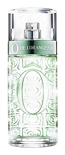
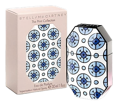
Stella McCartney's Print Collection arrived in 2012 as a trio: Print Stella 01, 02, and 03. Each bottle in the series carried a motif that had also appeared in the fashion line Stella McCartney Summer 2012, wrapping the established juice inside a print pulled from the runway's seasonal wardrobe. The idea was straightforward, letting a single fragrance live across three different visual expressions tied to one collection, each flacon becoming a small keepsake of the show that inspired it. Print 01 held its own place as the first of the three, the bottle that opened the series and set the visual template the others would follow. The oriental circles and vintage-style motifs gave the glass a graphic identity that read more like textile than typical perfume packaging.
Print 01 carried a motif described as oriental circles and vintage style, with oriental ceramic tiles rendered in beautiful colors wrapping the bottle. The design echoed the runway language of Stella McCartney Summer 2012, the same textile vocabulary that defined the fashion pieces shown that season. As a 2012 release, Print 01 became part of a short run tied to that year's print cycle, and the bottle itself stands as a record of how the house translated a seasonal fashion motif into a fragrance object.
The evolution
On skin, the opening announces itself with a bright burst of mandarin, that crisp citrus lift which feels cool precisely because the amber base around it carries so much warmth. The citrus flashes quickly at the surface, giving the composition its first lift before the florals begin to take over. Once the mandarin recedes, the heart opens through a pairing of peony and French rose, both listed as distinct notes in the composition rather than blended into a single accord. The peony contributes its soft, rounded petal quality, while the rose brings a fresh-cut floral depth that anchors the middle of the wear. Together they create a layered floral center that reads as the emotional core of the fragrance, generous without ever tipping into opulence.
Cultural impact
The Print Collection took a single established composition and presented it across three different bottle designs, each one drawing on a seasonal motif from the fashion line. In 2012, the motif was described as oriental circles and vintage style, with oriental ceramic tiles rendered in beautiful colors wrapping the glass. The previous year's bottles had carried a floral print, giving the 2012 release a more graphic, decorative visual identity by comparison. The strategy treated packaging as a seasonal statement rather than a permanent fixture, letting each year's print feel current to its moment while the juice inside remained unchanged.