

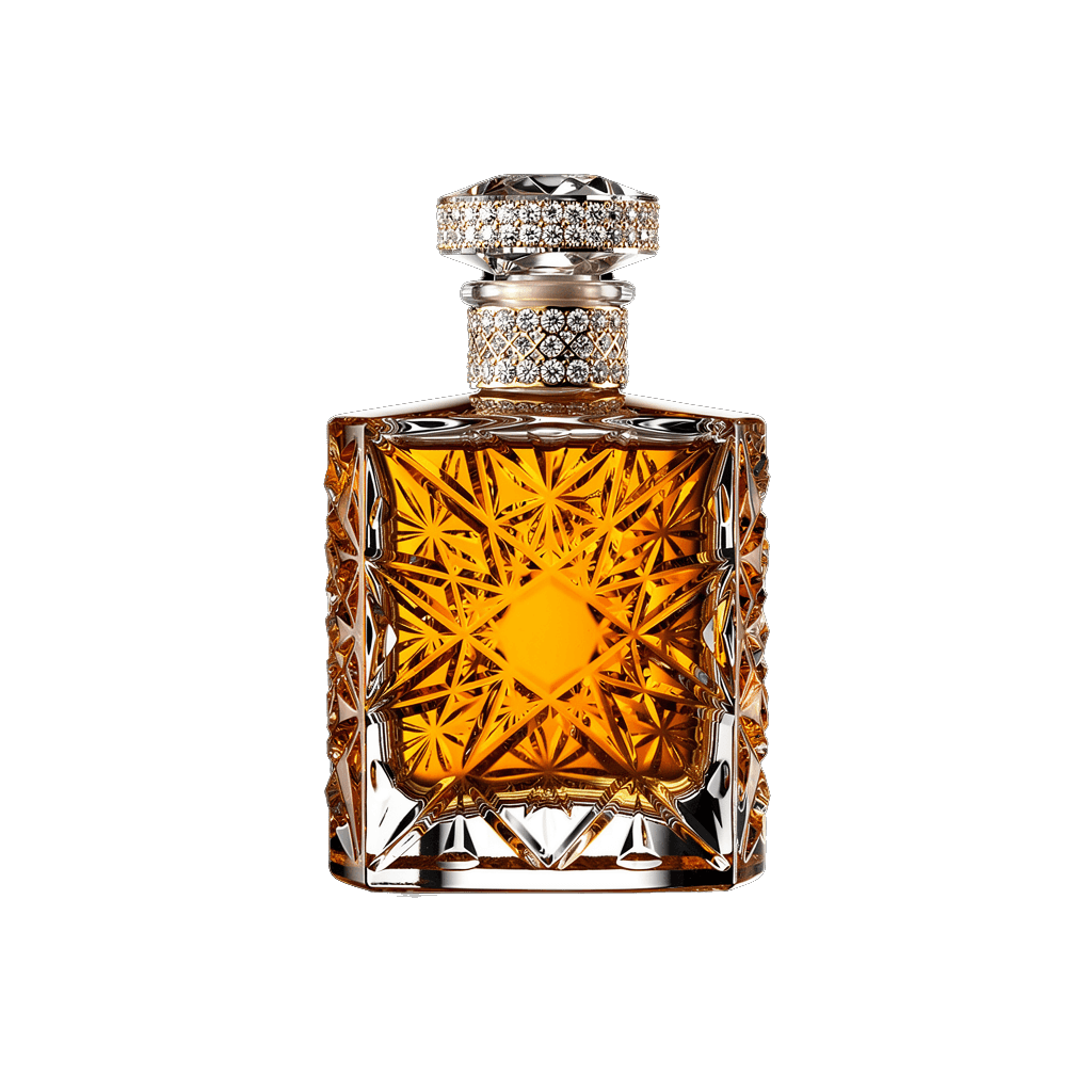

The Heritage
The Story of Sand + Fog
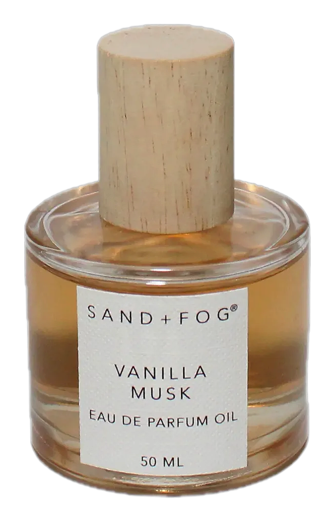
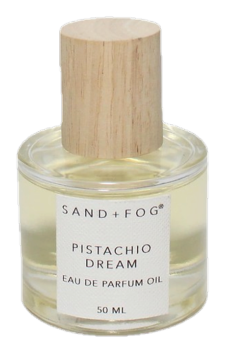
Sand + Fog is a California-based home fragrance brand founded by three women with a clear conviction: that a beautifully scented space should also be visually compelling. Beginning with candles that double as decorative objects, the company has grown into a broader fragrance house offering perfume oils and home scents designed for everyday rituals. The aesthetic draws on the landscape of the Southern California coast, leaning into soft neutral tones, textured glass, and uncluttered presentation. The brand's move from candles into personal fragrance oils reflects an organic evolution, responding to customer interest in scents that travel beyond the home. Releases like Pistachio Dream, Vanilla Musk, Cherry Silk, and multiple 2025 collections indicate a company actively expanding its olfactory vocabulary while keeping its visual language cohesive. The brand reportedly operates as a women-owned business, though detailed founder backgrounds remain limited in the public record.
Heritage
Sand + Fog emerged from a collaboration between three women entrepreneurs who identified a specific gap in the home fragrance market. Rather than choosing between aesthetics and scent, they insisted on both, starting with candles engineered to occupy visible spaces as honestly as they occupied a room. The Southern California coastline served as their informal creative reference, providing not just a color palette and material vocabulary but an underlying philosophy about living. That philosophy centers on ease, natural light, and the dissolving boundary between indoor comfort and outdoor atmosphere. The founders chose not to operate as public personalities, preferring instead to let the brand speak for itself. This decision has created a certain deliberate opacity around the company's origins, making it difficult to reconstruct a detailed founding narrative from public sources alone. What is verifiable is that the company launched into a market saturated with candle makers, differentiating through a design sensibility that favored muted earth tones, frosted glass, and restrained typography over the maximalist aesthetic still common in home fragrance at the time. Early distribution relied on independent boutiques and social media, where the brand's visual presentation proved immediately shareable. The aesthetic translates well to photography, and early adopters on Instagram and TikTok helped drive discovery. This organic growth pattern—product-led, visually coherent, community-driven—has remained characteristic even as the company has scaled. The transition from candles to room sprays and diffusers followed logically. The move into perfume oils represented a more significant pivot. By translating house scents into wearable formats, Sand + Fog invited customers to carry a specific olfactory mood out of the home environment. The gourmand territory of Banana Cream, released in 2020, demonstrated early appetite for playful, food-adjacent compositions. Later releases explored woodier and more directional territory with Bergamot & Oud, suggesting breadth within the brand's creative vision without abandoning the accessible warmth that defines it. The company continues to expand retail distribution, with products appearing at Target and various specialty retailers. While the brand's Black-owned status is referenced in external social media contexts (specifically promotional posts around Black History Month), verification of ownership structure through independent business records remains incomplete.
Craftsmanship
The production approach at Sand + Fog reflects practical priorities: clean-burning formulations, consistent scent performance, and product longevity. The candle line emphasizes minimal soot and reliable fragrance throw across burn sessions. While the company has not published detailed ingredient sourcing documentation or perfumer credits, its consistency across product categories suggests established partnerships with fragrance compounders who can deliver reproducible results batch after batch. The perfume oils are formatted for intimate, personal use. Roll-on applicators and compact bottles prioritize portability and reapplication over projection and longevity. Discovery sets offering two 0.5 fluid ounce oils enable customers to explore house scents in focused sampling before committing to full sizes. This format choice reflects the brand's broader interest in building familiarity rather than broadcasting presence. Absent named perfumers, it's reasonable to infer that Sand + Fog works with an external fragrance house or suppliers who develop formulations to specification. The absence of public perfumer credit is typical for brands in this market segment, where brand identity takes precedence over individual authorship. What matters is the outcome, not the attribution. Quality control appears oriented toward sensory consistency: batch-to-batch uniformity in scent profile, visual consistency in packaging, and durability in material choices. The amber-toned glass, frosted surfaces, and textured containers are selected to perform well over time, resisting discoloration and maintaining structural integrity. The brand does not lean heavily on technical fragrance language in its communication, relying instead on accessible descriptors that suggest emotional territory rather than chemical composition. The absence of specific ingredient disclosures means that the precise provenance of aromatic materials remains outside the public record. This is not unusual for independent fragrance brands but is worth noting for consumers seeking transparency about material sourcing. The current information available from external sources does not include detailed supply chain documentation.
Design Language
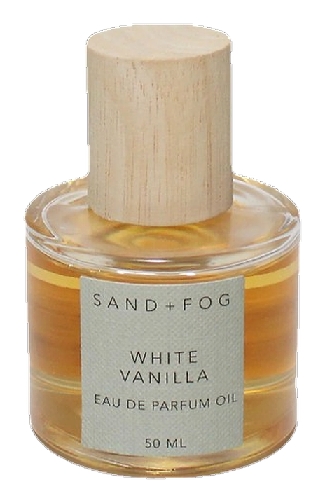
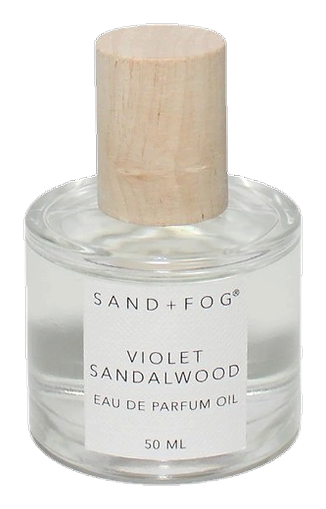
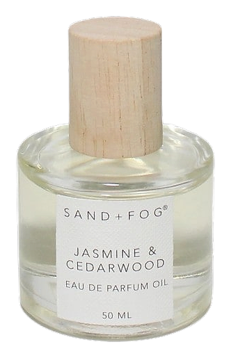
The visual language of Sand + Fog functions as an immediate shorthand for its personality. Soft neutrals anchor the palette: cream, warm taupe, muted grey, and sand. The brand name operates as a mood board, conjuring coastal atmosphere and diffused light without literal imagery. Nothing needs explaining. The aesthetic reads intuitively. Packaging reflects this restraint. Frosted glass appears across candles and perfume oils, with simple sans-serif typography and minimal labeling. Textures—subtle stippling, matte finishes, faint ribbing—invite physical engagement without demanding it. Bottles serve as both functional containers and decorative objects. This dual purpose was present from the beginning, baked into the founding philosophy that a candle should look as good as it smells. Photography across social media reinforces the visual logic: natural light, uncluttered surfaces, and occasional lifestyle detail (a ceramic cup, an open book, a window with sheer curtains). The framing avoids both luxury posturing and casual neglect, landing in a register that reads as naturally considered. Even holiday-themed collections and seasonal releases remain restrained, relying on scent variation rather than repackaging to signal novelty. The design system is durable enough to absorb new products without fragmenting. The perfume oil collection maintains complete visual continuity with the candle line. Identical bottle shapes carry different liquid colors, so the scent itself becomes part of the visual presentation. Cherry Silk reads distinctly from Pistachio Dream, and the chromatic variation communicates range without introducing visual noise. This consistency reinforces the brand's core message: atmosphere should be cohesive, whether in a room or on the skin. The brand does not use celebrity endorsement, editorial awards, or trend positioning to communicate credibility. Instead, it relies on the quality and coherence of its visual presentation. A discovery set arrives in the same aesthetic register as a large pillar candle, creating an immediately recognizable brand language that scales across price points and product categories. Competition within the accessible home fragrance and personal scent space is substantial. The companies maintaining market presence here tend toward either dramatic aesthetic statements or deliberately invisible design. Sand + Fog occupies the space between these approaches, present but not insistent, styled but not precious. This positioning feels sustainable ratherThan strategic—a reflection of how the founders actually want the products to function in people's lives rather than an explicit market play. The brand's approach to product photography deserves mention, particularly on social platforms where discovery occurs. Images tend toward the editorial-casual: natural lighting, minimal props, surfaces that suggest domestic realism without tipping into sterility. The atmosphere reads as considered without appearing constructed. This visual approach has likely contributed to the brand's organic growth on platforms like Instagram and TikTok, where a strong visual first impression drives secondary engagement with product details. Color theory plays a quiet role in the aesthetic. The warm earth palette—sand, taupe, cream, amber—carries differently across product categories. On frosted glass, these tones read as soft and diffuse, reinforcing the brand's atmospheric positioning. On a smaller scale, with perfume oils, the same colors create intimacy. The aesthetic scales without diluting its essential character. Label design remains minimal. The brand name appears simply, with scent names in a complementary weight, and basic product information without unnecessary detail. This lack of information density is itself a choice: it keeps the product visually quiet, allowing the object itself to communicate. For a brand built on atmospheric appeal, this quietness reads as confidence rather than deficiency.
Philosophy
The guiding principle at Sand + Fog holds that scent should never operate in isolation. A room fragrance exists in relationship to its environment, the objects nearby, and the quality of light entering the space. This philosophy shapes decisions about wax composition, wick engineering, and fragrance concentration in the candle line, and it carries through to the perfume oils. The founders understood that consumers increasingly treat their homes as personal retreats, and that the visual and tactile presentation of a fragrance product contributes meaningfully to the ritual of using it. Versatility sits at the center of the approach. Rather than chasing seasonal trends or building limited-edition collections around calendar moments, Sand + Fog tends toward compositions that read as familiar but distinctly executed. Banana Cream exemplifies this: it takes a universally beloved flavor note and builds a fragrance around intimate, skin-close presence rather than projecting outward. Vanilla Musk follows a similar logic, grounding a classic accord in contexts where personal wear makes sense. The extension into personal fragrance came from recognizing that scent does not stop at the front door. A candle burned in the morning can inform the choice of perfume oil in the afternoon. This continuity between home and body is intentional. Pistachio Dream or Vanilla Musk applied to the wrist represents an extension of an atmosphere rather than a departure from one. The brand occupies a specific position in the fragrance landscape that is neither exclusive nor trying to be. There is no language about heritage, lineage, or perfumery tradition. Instead, the communication style is direct and practical, describing what a scent evokes without resorting to symbolic interpretation. This is a deliberate choice that makes the brand approachable without dumbing down the product. Customers are trusted to project their own emotional associations onto the materials they are buying. Aesthetic choices reinforce this philosophy. The brand name functions as a mood board, inviting interpretation rather than prescribing it. The packaging reflects a preference for the experiential over the declarative. Nothing in the aesthetic demands to be understood all at once.
Key Milestones
2020
Banana Cream launched as one of the earliest gourmand fragrances in the Sand + Fog line, establishing the brand's willingness to work with playful, food-adjacent notes.
2024
Pistachio Dream and Vanilla Musk both debuted, reflecting continued investment in the personal fragrance oil category alongside the core home scent line.
Early 2025
Multiple fragrance releases across both home and personal categories, including Cherry Silk, Velvet Blossom, Bergamot Bloom, Golden Glow, and Cherry Kiss.
Mid-2025
Bergamot & Oud arrived as a directional counterpoint to the sweeter, more approachable scents in the house, signaling breadth in the brand's creative range.
At a Glance
Brand profile snapshot
Origin
USA
Collection
1
Fragrances released
Avg Rating
4.3
Community sentiment
Release Rhythm


